Configuring Scatter Charts
Overview
A Scatter Chart is a valuable tool for revealing relationships between two numerical variables. Scatter charts plot individual data points on a graph with horizontal and vertical axes representing the two variables. This visualization helps identify correlations or clusters, suggesting potential cause-and-effect relationships between variables.
Getting Started
Before configuring a Scatter Chart, ensure you have:
- Two numerical variables to analyze
- Access to the relevant dataset in InsightsIQ
- Defined objectives for your analysis
Business Value
- Discover correlations between variables
- Detect outliers in your data
- Make informed decisions to optimize strategies
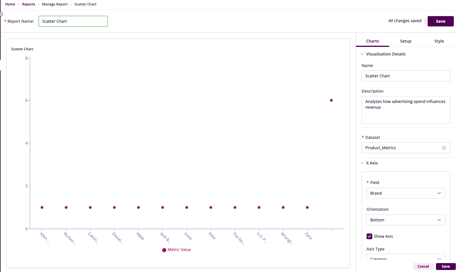
Chart Configuration
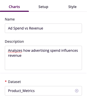
Basic Configuration
- Name: Provide a descriptive title
- Description: Explain the chart's purpose
- Dataset: Select the relevant dataset
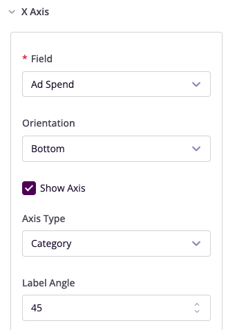
X-Axis Configuration
- Field: Choose the independent variable
- Orientation: Position labels
- Angle: Adjust label angles
- Show Axis: Toggle visibility
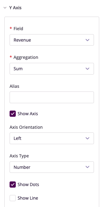
Y-Axis Configuration
- Field: Select the dependent variable
- Aggregation: Choose summary method
- Show Dots: Toggle data point visibility
- Add Secondary Y-Axis: Optional additional variable
Advanced Features
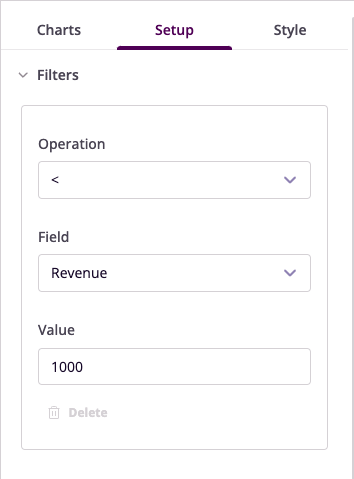
Filters
Configure data filters to refine your visualization:
- Operation: Select conditional operator
- Field: Choose column to filter
- Value: Set filter criteria
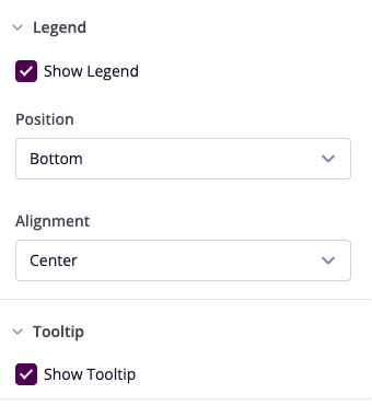
Legend and Tooltip
- Show Legend: Toggle visibility
- Position: Set legend location
- Show Tooltip: Enable hover details
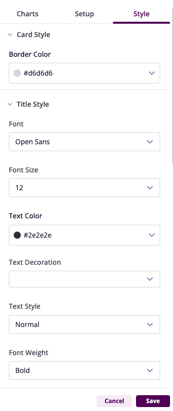
Style Customization
- Reference Lines: Add benchmarks
- Highlight Clusters: Emphasize data groups
- Customize Colors: Adjust visual appearance
Example Use Cases
Ad Spend vs Revenue Analysis
- Chart Type: Scatter Chart
- X-Axis: Ad Spend
- Y-Axis: Revenue
- Insights: Correlation between spending and revenue generation
Price vs Units Sold
- Chart Type: Scatter Chart
- X-Axis: Price
- Y-Axis: Units Sold
- Insights: Optimal pricing points for maximum sales